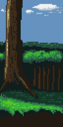
Feedback/critique please

Hii all, I have been workin on learning to use and create colour ramps and I think I have just about got my head around it.
so I've been pratacing here and there as I look towards making my work more detailed.
i would like some feedback on this small piece I have done, does it look ok? Is it coherent?
Any feedback or criticism is welcome. :)
thanks in advance.
Attachments:


It looks good to me. It's a big tree in front of a thick forest of other trees in the background correct?
It looks better than mine, I still oversaturate and can't get my head around things.
-Justin Lewis @ justinlewis195@gmail.com
@isaiah689 yes, that's correct. Thanks. :)
Chasersgaming | Support | Monstropolis |
I think it looks ok, however i would maybe have at least one branch on the big tree and some leaves and branches on the ones at the back as to me the trees look very tall.
Love the grass area
Best regards
Ninja Dog