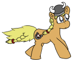
Pixel art vs. eehh ... not pixel art, vol. 2
SO I have trouble deciding upon an art style for that accursed pony game, I think everything looks ugly and yadda yadda yadda....
Do you have any opinion on which of these 2 styles is better, a sort of hand-drawn style, or a pixel art style with no hard outlines? Feedback is very much appreciated ^-^
The game runs at a screen resolution of 960x540 and uses ponypalette.png as the color palette for the main character, but I have an idea that it may be used for the entire game.
The pony OC in question, Valkyria , belongs to her rightful owner, LittleHybridShila (and is used with permission)
https://littlehybridshila.deviantart.com/
~Spring
Attachments:


And although this is not a commission thread, I'd still like too see if there are any artists out there who have a bid for the art style , not that i can pay you that much, and i honestly don't know if i trust hiring external people for so large projects
Trying a different style but it's still so ugly.
Always a sad realization when you don't have enough skill to make the game you really want. :P
I know what you mean, i feel like that too, but do it anyway!
i like pixval3. :)
Chasersgaming | Support | Monstropolis |
Thank you so much for your input chaser! :3
The brony community means a lot to me and harbors so many wonderfully talented artists , so I really want a chance to impress them and show them all what I can do!
@chasersgaming btw I just tried out your game monstropolis, while it's hard to control and could use better graphics for the humans, it's a very cool, pretty unique concept!
You should almost introduce some sort of combo feature for smashing humans with other humans :)
Thanks for your nice comment on Monstropolis.it was a project that I started a long time ago, my artwork has improve quite a lot since then. The controls are some what awkward, I did try and improve them with some keyboard functions, but still not a best, however it works well on an iPad, so it will probly move to that format ideally, with like you say some improved artwork. There are lots of things suggested that I didn't put in and probably won't because I would never get it finished, I'd just keep going and going. I have written 4 other games since then and I'm keen to get cracking on those. :)
Chasersgaming | Support | Monstropolis |
Well good luck on those then, maybe I'll get to trying some of them out someday :) If your graphics have improved, and you're still capable of thinking up unique concepts, it could end up pretty good!
In the meantime, what do you think about pixval4? do you prefer it to pixval3?
I'm sold on pixva3, it's a very nice Sprite. Although I'm no expert, I would say the dithering on pixval4 is too much, but that's only my opinion, it's still a nice Sprite all the same. Pixval3 for me. :)
Chasersgaming | Support | Monstropolis |
Well I'll go with that one then, since it's a heck of a lot easier to animate than the other one XD
And you don't think the hand-drawn one stands a chance compared to the pixelart ones, btw?
I do neither.
Cool, be good to see it animated, please show when you do. Good luck with it, :)
Chasersgaming | Support | Monstropolis |
All the images on this thread look pixelated, so I can't comment on the hand drawn one.:)
Chasersgaming | Support | Monstropolis |
Someone wanted animations?
Keep in mind that the character is copyrighted if you want to download these. :P
So I have made mockups (well, not really , just screenshots of the actual game loaded with different textures) of the fire level in both art styles, what do you think is best?
Imo the pixel art one is probably a little bit superior, but none of them really look good :P
Also now, a scene of the "world map" screen.
looking at the style of game sprites I would say the first however if you want the difference between characters and backgrounds to be really noticeable I would say the second.
You have a point that the characters should be distinguishable from the backgrounds. But I still like the first one better. Problem is that none of them actually have the quality I want, but I guess I'll have to make due.
what I do when nothing works for me is I make a simple one and as I work on the rest of the game or project I go back and adjust something small every time until I get either what I want or as close as I'll get.
Depending on the programs you use this may be easier or harder then I make it out to be. I use Paint so everything is pretty difficult for me to make things of this quality. It takes me AGES to get something good.
my advice would be keep working on it until YOU are happy with it.
If only I had ages to spend XD I've been taking a 3 month hiatus with this project and is now remaking it from scratch, so I have quite a bit to catch up on. But perhaphs I should just accept that yeah this is going to be a 1-2 year project....
The problem is nobody will care about MLP by then ! XD
don't worry. I was working on a game for around two years. the game was put on hiatus nearly 3-4 months ago. I recently started making art for it again. I'm sure you've seen the dungeon tiles I made not to long ago so I know what it's like to start from scratch with an old project.
as for people not caring all I can say is then try to have a positive attitude towards the game. don't think of it as "people don't care about MLP anymore" think of it as "this game will bring back the MLP fandom"
another thing is if you ever need help there are people who are willing to take the time to help with a project. some do ask for a payment of some kind however there are people who do it for the fun and knowing they can help others. If you need help you can always just ask, the worst that can happen is they say no.
Not sure I've actually seen those dungeon tiles. Only the grassland ones with the green pillars that I made a background for.
The problem I find with hiring people is that it quickly becomes extremely hard to keep the style of the game coordinated if you don't boss them around, and I don't wanna do that. I don't like projects with more than 3-4 people, because that's when leadership and a management hierarchy start to become more and more necessary, and I want an active role in development, not just fund it XD if that makes any sense. The other thing is that I can't actually really find anyone who's better than me for what I want, of course there are plenty who are better in general XD
Do you think it looks better at this low screen resolution btw?
Before it was running 1920x1080. Now it's 640x360. I found it was too hard to see the characters on screen like you said when the resolution was that high, and I started to introduce enemies.
yeah I understand. having other people doing art can take away from the art as a whole as everything would look different. However I also know working in a team can be hard. every game I've worked on in a team has had only 2-5 people working on it as I think the same as you it seams. However I wouldn't give up on the idea of working with others just yet you might just be surprised. ;)
I haven't strictly given up the idea. I'll especially like to see what others can come up in terms of soundtrack ideas and level design.
An idea for enemies? I must admit I like the idea of an evil emo pony cult XD
With armor
New idea for visual style, I wasn't 100% satisfied with the former one. This may be more simple but it's also cuter and more stylish.
@spring
your animation is tiny but awesome
do you have a small animated flag by any chance?
maybe say 4-6 frames
best regards
Ninja Dog
I can make that! Sorry I didn't repsond until now, I didn't get notified for some reason.
For some reason I changed the game into a Lemmings clone
Added the digggers and the bashers
Implementing more tasks from Lemmings