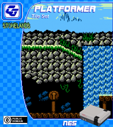
PLATFORMER Tile Set 'StoneLands'
Author:
Friday, February 1, 2019 - 05:52
Art Type:
License(s):
Collections:
- 2d Platformer
- A Pool: Unsorted (GDN)
- Adventures of KEROGE
- agent chaser assets
- Assets for making DOS games or games like in DOS in the early 90's
- BinxQuest
- CC0 - Public Domain - NES
- CF Inspiration
- Hurry Magical Monkey!
- NES-like
- PGMMV - TEST PROJECT
- platformer
- Ragnar's CC0 Bag of Holding
- Tile Set: Side Scroller
- Tilesets
Favorites:
16
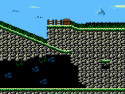
A Stoned environment with grass surrounds that includes trees, fences, ladders and vines. Also the frames for waterfalls.
This asset has been created using a colour pallette from a PAL model NES system and its colour limitations to provide you with graphics needed to create a genuine looking NES game. :)
Enjoy!
Like my assets? Consider supporting on Patreon. :)
https://www.patreon.com/Chasersgaming
Gameboy version available here:
https://chasersgaming.itch.io/platformer-asset-tile-set-stonelands-gameboy
Copyright/Attribution Notice:
Free to as you want, no credit or permission needed, but always appreciated.:) You could hit that fav button and/or share this asset on your social networks!
File(s):


Comments
Perfect work
This looks so good!
Perfect environment for a furry wrestling deathmatch!
FANTASTIC!
Really great NES set! Although, I think it looks even better on SMS! ;)
Seriously though, your sets keep getting better and better. Really like the use of black as a both dark and shadow on the rocks in this set. It's a common trick I know, but you did a great job with it here and it gives the set a very authentic NES look. :)
btw, in case it wasn't obvious, that's a re-color to the Sega Master System palette. Two variants because I couldn't decide if the lighter or darker brown looked better. Well, I thought the brighter brown looked better since all the other colors also got a bit brighter in the conversion, but the dark brown is closer to the orginal.
Color question for you, I notice the clouds, waterfall highlight and mountain highlight use a kind of bright slightly sickly green. Any special reason you went with that instead of one of the bright blues? I chose a bright blue on the SMS conversion there but only really because SMS only has one bright green like that and I'd already used it for the ground/grass highlight.
Nice, Contra style.
@snabisch @withthelove @Bobjt Wow, thanks very much for the nice comments! glad you like it.:)
@withthelove thanks for converting to the SMS colours, they look cool!, i like the lighter brown too.
'Any special reason you went for light green instead of blue'
Yes, the light blue in the NES palette didn't quite look right to me and felt the colour with a hint of green worked best. :)
@anyone
when the NES loads up its background tiles, the 4 colours from any of the 4 palettes are used in 16x16 blocks, so although you can used any 8x8 tile, those tiles will be using whatever palette is selected in that 16x16 area. this is a fun limitation and it also makes colour selection interesting when colours need 'sharing' between tiles. hope that makes sense. :)
honestly, thanks for the comments, im flattered. and i did have some help from the nesdev community, whom were also encouraging. my progression is getting much better. :)
This is super duper authentic! Great work!
@chasersgaming: Cool! That green is actually a really good choice, it gives the set a slighlty off, slightly creepy vibe that is really cool an unique. Gives the set just the right hint of personality. You can see the diffence with my SMS versions that use a more traditional color choice there. It still looks great, but it's a bit more vanilla compared to your stellar orignal.
I have updated the download files to now include BMP files. These BMP files have been edited and set up to work with NESmaker software for easy importing, i have even included the colour pallete too. :) and as they are BMP files you can use these for 'Homebrew' projects as well.
Thanks. :)