Feedback on map and screenshot of my game
Thursday, June 18, 2015 - 13:14
Hi all
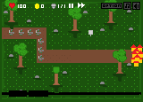
I'm a flash dev that's just started making graphical games. This one is heavily pixel with a hint of non-pixel art and I just want some feedback on how it looks. I have no eye for this, so it crappy; how can I make it better? I just needs lots of criticms because I want to try to make it as good as possible.
Thanks!!!!
PS: I got the base map from someone that did a map tutorial on this site. So I'm recycling that :)
Attachments:


I’m pretty bad at pixel art, so please take my words with a grain of salt. But I'll still try to describe things that I find stange in the screenshot.
1. First of all, shadows. Why trees have a shadow to the bottom, while some rocks have shadow to the right? Shadows should fall uniformly. (The leftmost topmost rock even has a negative shadow: shadow which is lighter than the surroundings. Negative shadow might be an interesting idea to exploit in some game, but if your game is not about it, you probably don't want it.)
Also, shadows of the trees. Shadow should basically be same as image of your tree, but reversed and shrunk (or made longer, depends on the light source). Yours is not reversed, which is wrong.
Also, houses probably should have a shadow too?
Here’s what it could look if you fixed the shadows:
2. Second, trees. I have never seen trees with such a foliage. I'm not a botanist, but I think only palms have leaves on top and a large leafless trunk. And since this is not a palm, this looks wrong. I would add more foliage:
Note: my trees are not ideal, they look tilted to the right. But you get the idea.
3. Why is grass arranged in geometric patterns? If these patterns have some in-game significance (i.e. they are the grid showing how heroes can move), then make them more prominent. Why doesn’t road have the same patterns? Add them to the road too. (Yes, it has some, but they seem different and don’t feel they belong to the same system.)
If they don’t have any significance, then just eliminate the pattern. It may be difficult, I know. Just keep removing the patterns than reinforce the grid, and checking again...
4. Also, houses are not very detailed compared to other things on the scene. Probably they need some love.
Mmmm... first of all try increasing resolution and color depth. If it's not intended for my mid-2000s mobile phone...
Sectond... try to skim through OGA to find some larger&good pixelart trees&tiles (maybe you'll prefer a good tileset for art consistency & easier license tracking).
If for some reason you don't want any external art in your game, then add some noise to the tiles (e.g. GIMP>Filters>Noise>Add RGB noise) they'll immediately start looking better.
> increasing resolution
While increasing the resolution may be a good advice for the end user to like your game (I mean, it won't be blocky; only pixel-art enthusiasts like blocky games, most users don't), it won't help you if you want to learn how to draw.
Drawing in larger resolution may be much more difficult that in lower. Compare http://opengameart.org/content/classical-ruin-tiles and http://opengameart.org/comment/33760 — higher-resolution version actually looks much worse than the original.
Also, quite a lot can be accomplished with a small limited resoultion and a limited colour palette. See Heroine Dusk as a nice example.
> and color depth
As for color depth, it's already RGB in that picture. :P The problem is not technical (are there enough colours in the picture?), the problem how the available colours are used.
There're indeed some problems with the colours used, e.g. the coin actually has 3 shades, but they're so close to each other that it looks like a solid colour (although this might depend on the contrast setting on your monitor).
@cdosrun: Demetrius's is right about the trees not being anatomically correct. That said, I find the original trees quite charming!
For the shadows, I wouldn't go so literal. Just a little dark blob at their base should be plenty enough. You're really just tring to connect them to the ground. Trying to show the contours of an actual shadow will just give the shadows too much detail and realism compared to the rest of the scene.
I definitely 2nd Demetrius' comment about the grass tile having too much of grid to it's pattern. That's probably the single biggest problem with the image. Just try to move the highlight pixels around a bit to break up the pattern. Another thing you might try, if you're tech allows, is to have 3-4 different grass tiles and randomly mix them up. Another tip would be to use a less contrasted green for the highlight pixels, so something closer to the base.
The little character sprite is pretty fun, but you might try making his sheild a more distinct color from his body. Maybe a brown or something, just to help make it clearly not part of him. Currently, it looks like it could be just a big hand or forearm.
The buildings are a little bright and plain compared to the rest of the scene. The probably need just a slightly less saturated yellow and some small details added (windows maybe).
Overall, I'd say it is crude but rather charming.
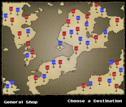
The map I'd say is somehow over-sharp. Or maybe it's just that not all the elements share the same level of detail. The base map is very high-res with lots of fine detail (the little waves, the broad gradient and lots of little noise). The land masses seem to have a little less fine detail on the insides, although their edges are full of fine detail (lots of little nooks and crannies to their outlines). The edges don't seem to have much anti-aliasing to them though, so their very contrasty and sharp. The 'SoS' flags have a lot less detail, being very flat and looking slightly lower-res. Finally, the text at the bottom of the screen is clearly much, much lower res than everything else.
https://withthelove.itch.io/
The objects themselves can be improved, but i'll focus on some ideas I have about the use of color and space.
Basically, I think it's too "matchy".
Everything is scattered a bit too evenly and there aren't enough little localized zones of interest. Here's some specific things I see, and changed:
Too many rocks. It doesn't really add variety if they're everywhere. Having them spaced somewhat evenly adds to this problem.
Too many dots. The pixels in the grass are too high contrast to have them all over, and they don't imply any kind of texture to it; just a bit noisy.
Here's how I've changed a few things:
I changed the pixels in the grass to be less frequent and made some look like blades of grass. Note that I never place them near the tops of trees; it breaks the illusion of perspective, as it'd be strange to see grass with the same detail from the top of the treeline as at the base (we aren't going for any mind-blowing real perspective thing here, and I don't address shadows, etc either). I also clustered the grass highlights a bit more around the rocks, giving the impression that the rocks are displacing the grass a bit. I also changed the grass colors above the road. The road makes it easy to avoid any kind of dithered transition or something fancy, and it looks nicer.
Thank you everyone for the tips and criticsm! Please keep them coming!
I will apply what I'm learning here in the coming days as I overhaul the graphics :)
@SpiderDave: That was really good! I think you just took us all to school with those comments, I know I learned a thing or two reading them! :)
https://withthelove.itch.io/
Btw you don't have to redraw the tree tops, just make the trunks much much shorter. They look pretty good small.
I just wanted to add that the map could use a little work. right now its just a bunch of flags randomly placed. In terms of being a player in your game It doesnt seem to make any difference which destination I pick. They very well could all be different in some way, but theres no way to tell using that map. If you cant figure a better way to do this then I would change it to where you progress around the map with areas that branch off that you do in order. It just makes more sense.
Try realistic looking gras.