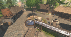
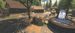
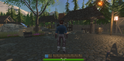
I am not happy with this look!
Hello,
We are working on a small open world rpg. It's just a project we like to occupy ourselves in our free time and we are combining assets with homemade objects.
However we are working on a very small and simple town and I just don't like the look of it in general. But staring at it all the time makes you blind for flaws. So what is the first thing that comes in mind, which you would change if you could.
Thanks anyway :)


I think it does not look bad, you are a bit harsh with yourself. There are definitly things I could see improved but It's a very impressive start.
to help me guide my answer could you let us know which game engine are you using? But in general I would say look for ambiant lighting based on the sky (IBL etc). This is a way to modulate the ambiant light with the sky texture and it makes everything looks amazing.
The water looks horrible especially the waterfall, you should spend some time to improve it or at least add some particles to make it more interesting.
Some assets like the haystack are weirdly blocky. They do not fit with the rest of your style.
Goodwin Madron
I liked it. And the waterfall from the watermill (or whatever) could be better, I think, too. It looks like a plain water surface, not like a waterfall.
Greetings
Peter